WORK / KLP
Lifelines and connections between individual events in life worth taking care of
AGENCY
Scandinavian Design Group
CLIENT
KLP
DESIGN TEAM
Thomas Ramskjell
Sunniva Djupedal
Ida Louise Andersen
Scandinavian Design Group
CLIENT
KLP
DESIGN TEAM
Thomas Ramskjell
Sunniva Djupedal
Ida Louise Andersen
BACKGROUND
Norway’s largest life insurance company KL has a heritage going back to 1949 in delivering services to people working in the public sector. Feedback revealed that the current logo mark has a strong position, but the identity was perceived as less suitable for digital media. Our brief included updating the visual identity to function well through printed and digital touchpoints.
SOLUTION
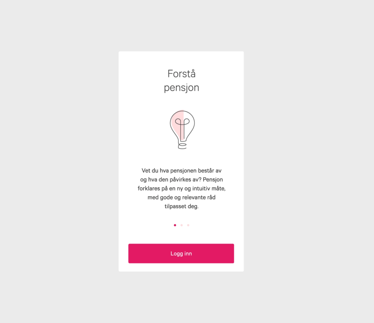
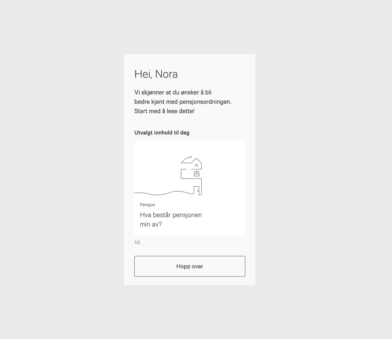
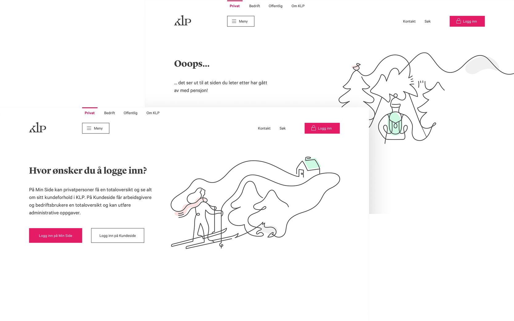
Because of its unique position as a company for people working in the public sector we wanted to keep a warm and human approach. We created a framework around the concept of lifelines and connections between individual events in life worth taking care of.
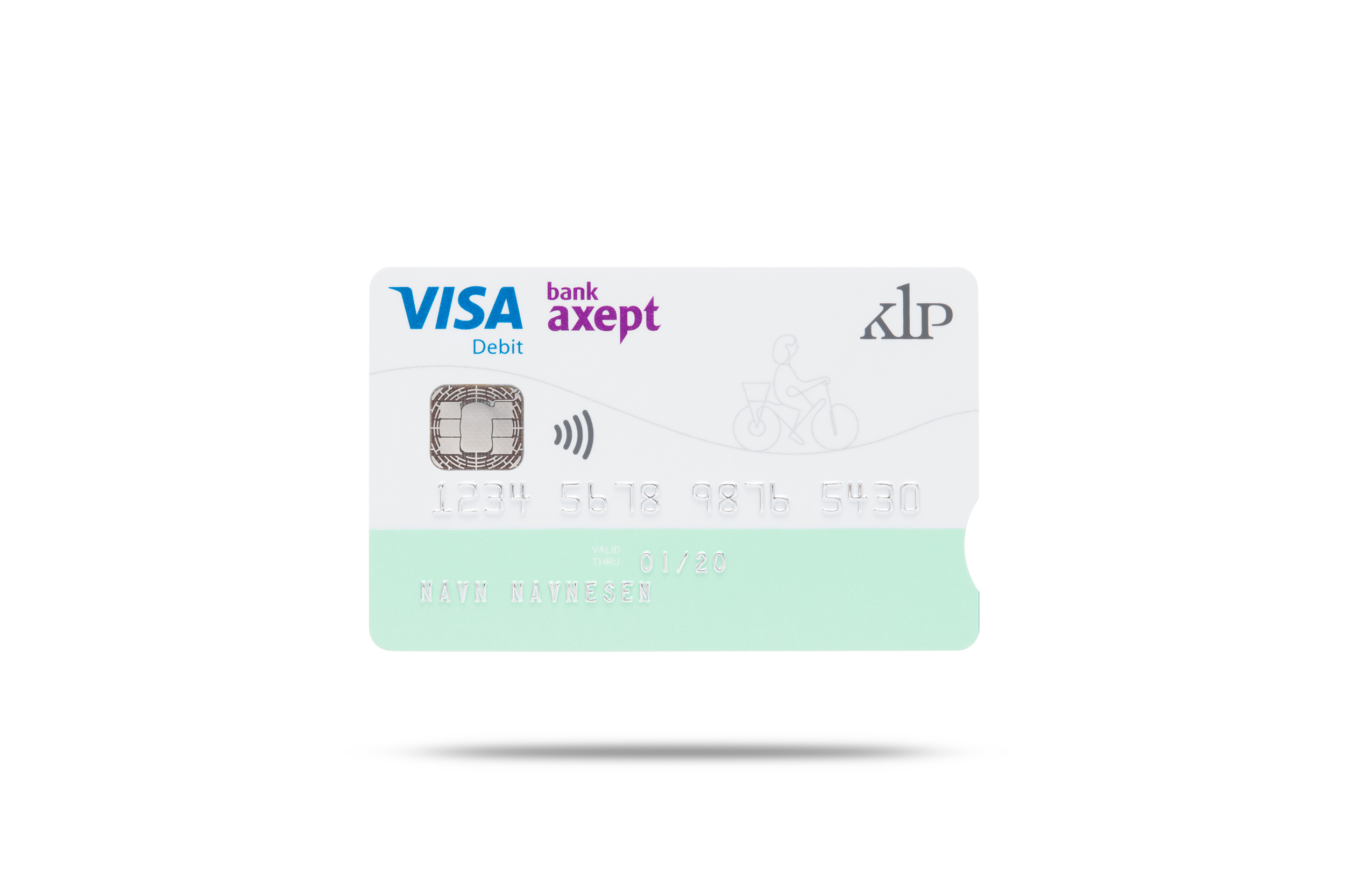
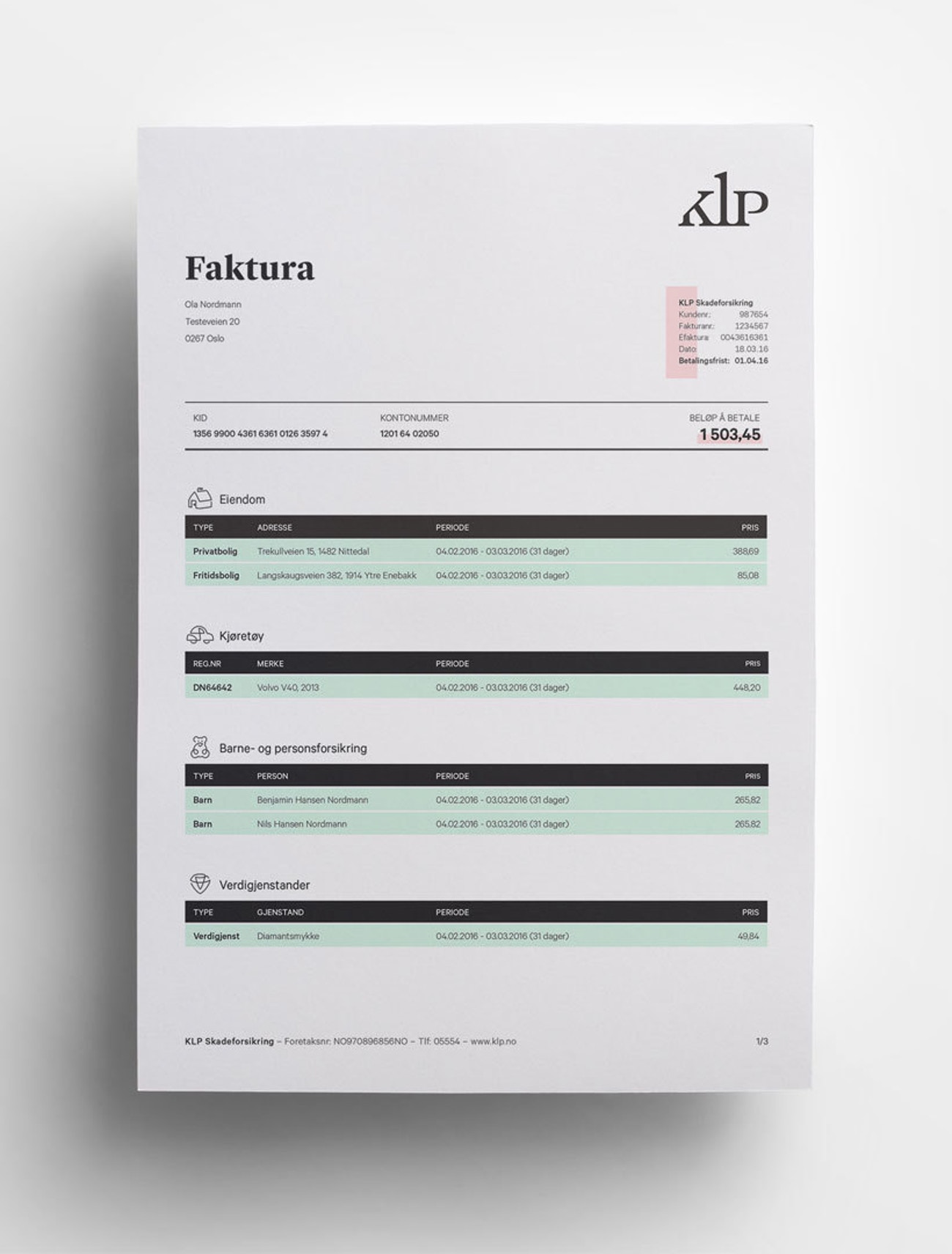
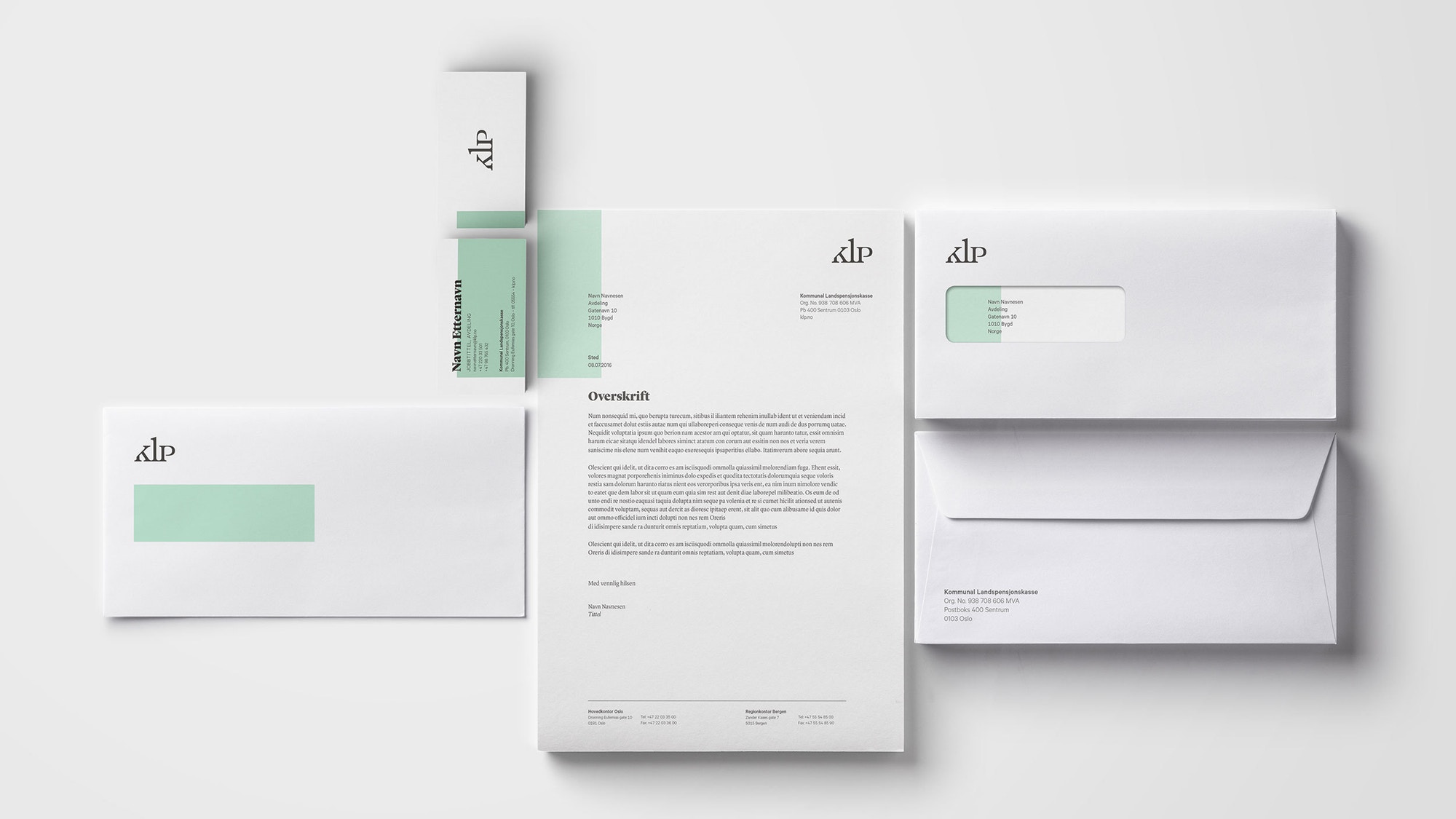
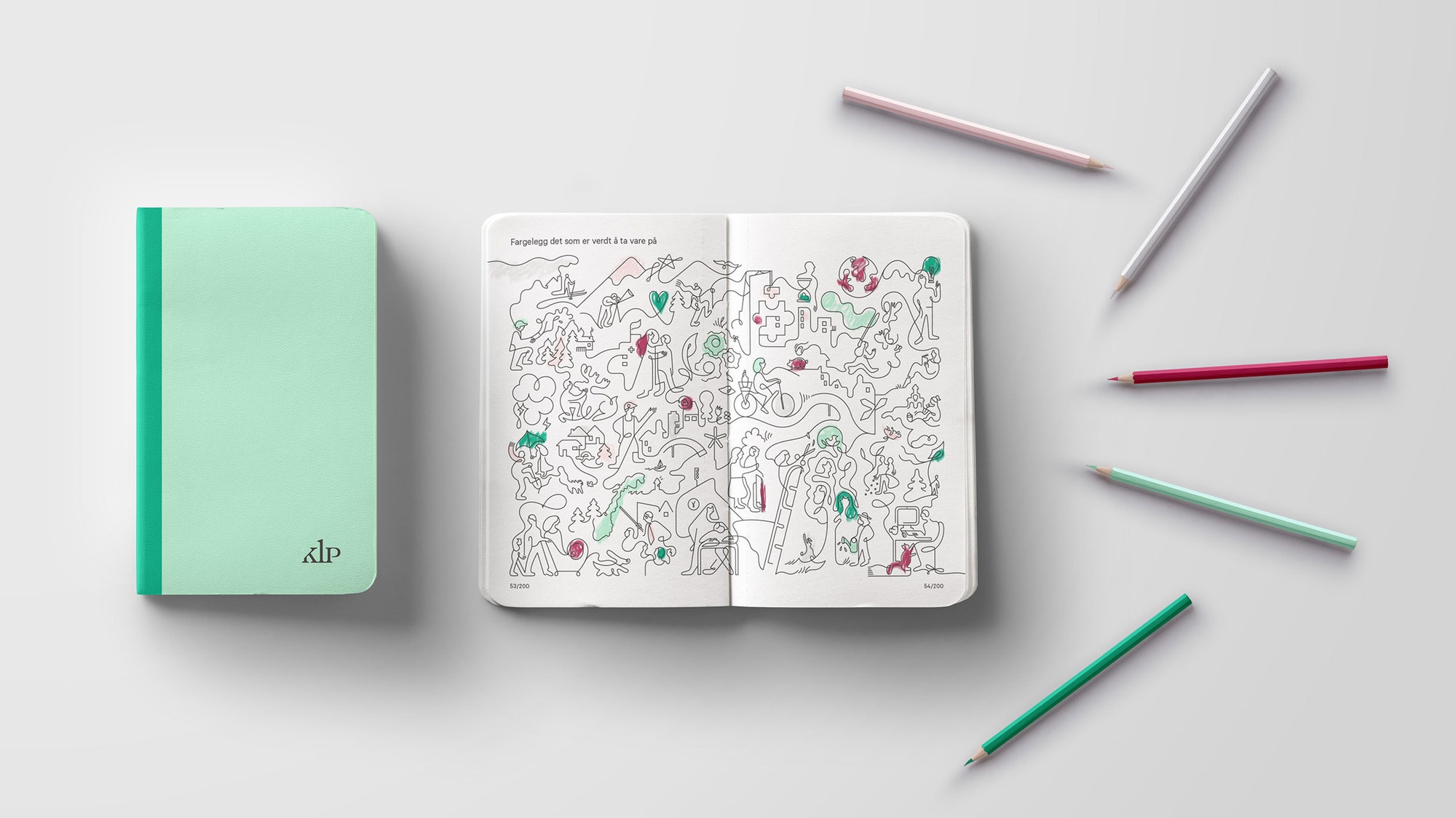
Color layers are used to connect image and text, the illustration is drawn using one singular line. Everyday snapshots are used to communicate all aspects of life.
Norway’s largest life insurance company KL has a heritage going back to 1949 in delivering services to people working in the public sector. Feedback revealed that the current logo mark has a strong position, but the identity was perceived as less suitable for digital media. Our brief included updating the visual identity to function well through printed and digital touchpoints.
SOLUTION
Because of its unique position as a company for people working in the public sector we wanted to keep a warm and human approach. We created a framework around the concept of lifelines and connections between individual events in life worth taking care of.
Color layers are used to connect image and text, the illustration is drawn using one singular line. Everyday snapshots are used to communicate all aspects of life.

The illustrations create life; playful engagement and builds character into the toolbox. The continuous line refers to the pulse and the course of life. They have a functional and explanatory role that supports the underlying communication strategy.


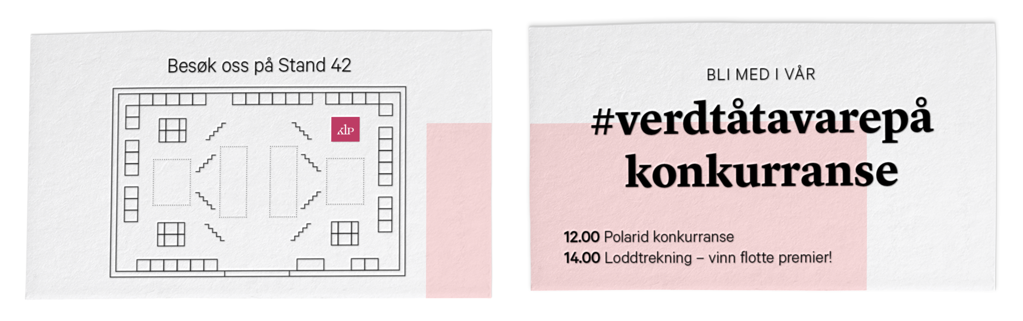
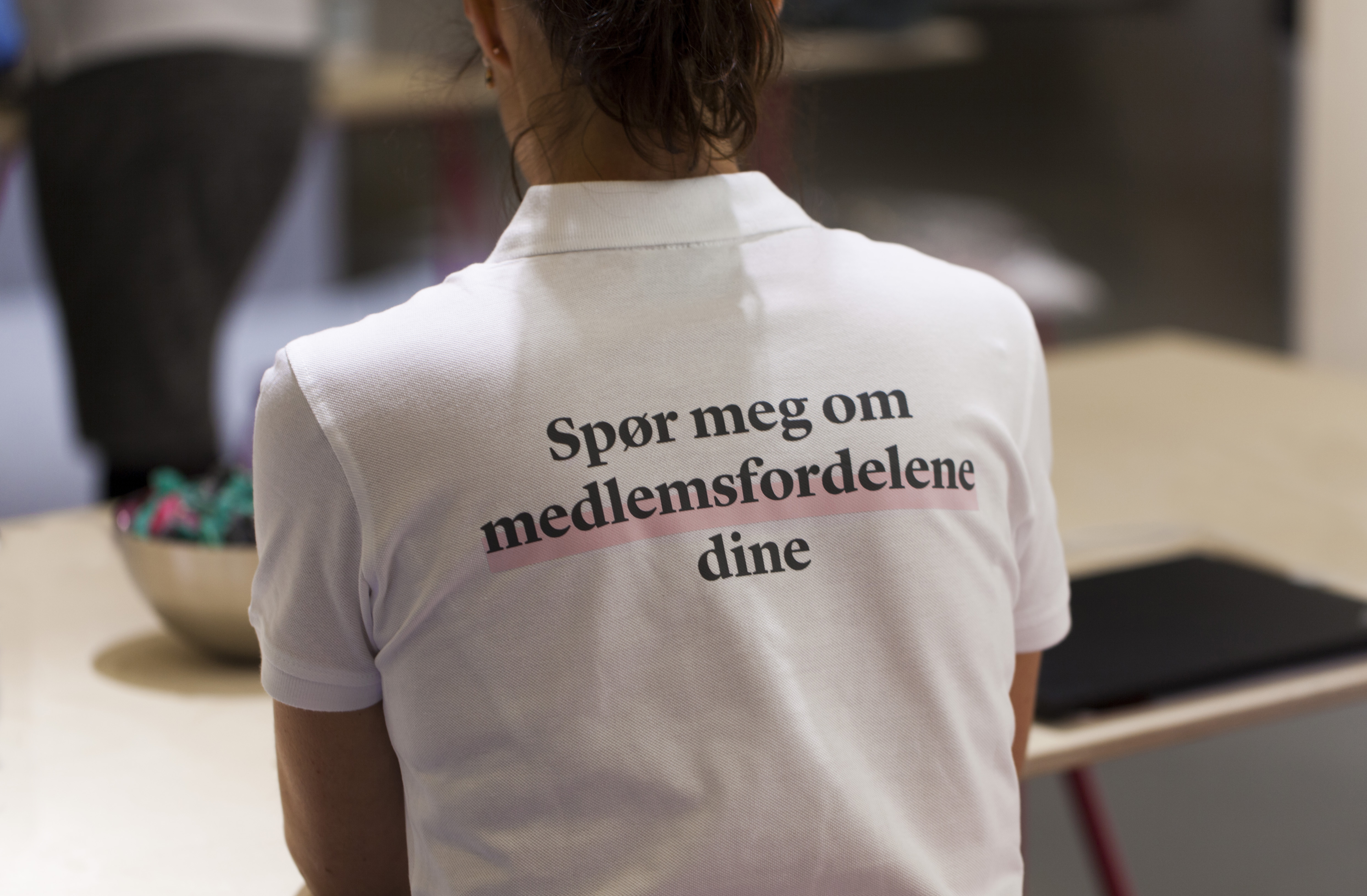
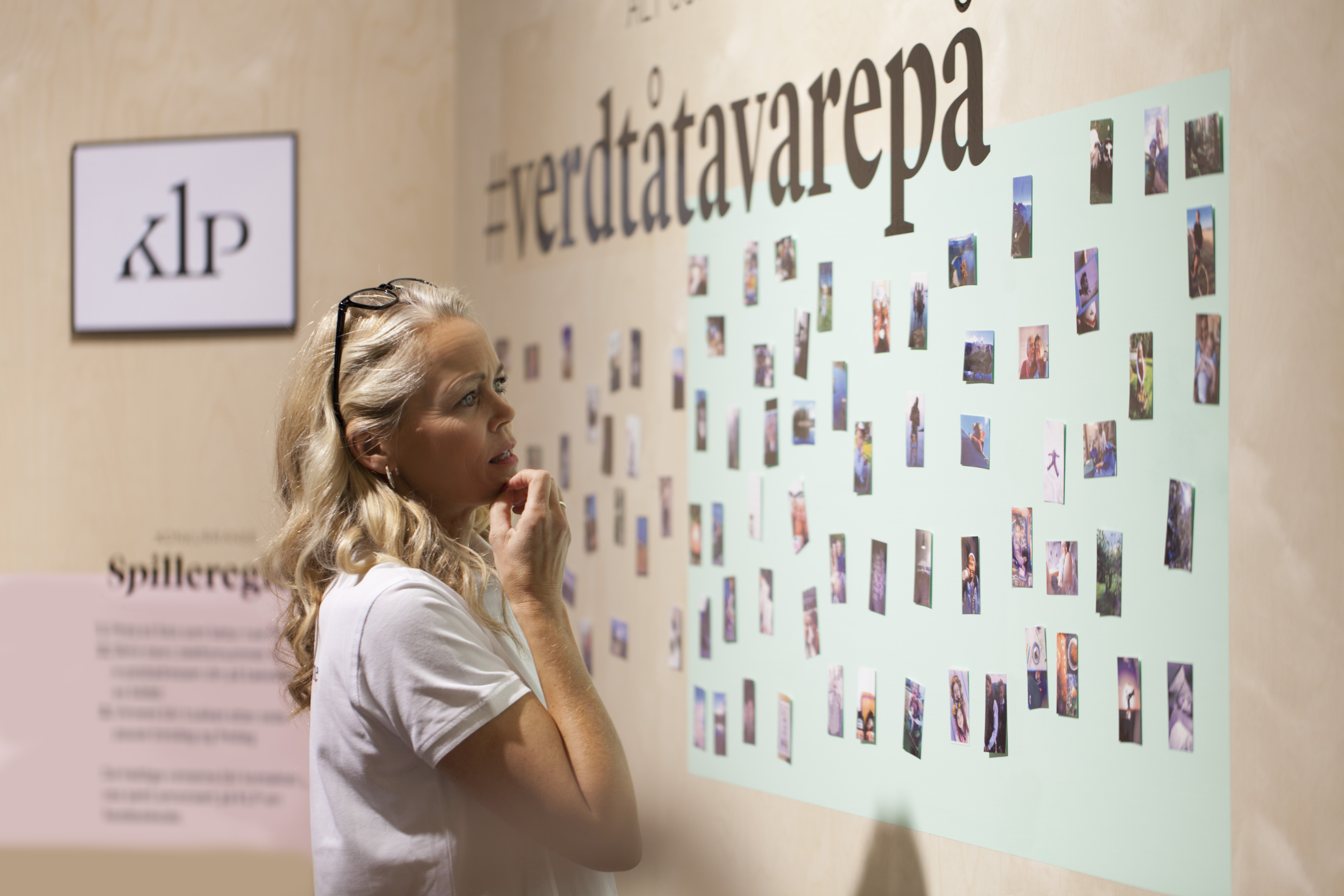
KLP stand
Nurses are an important target group for KLP. In September 2016, a big conference for nurses was held in Oslo. As a key arena for an important target group, we wanted to express our gratitude toward the people who dedicate their lives to take care of others.